Forky’s Story
While I was living in Shenzhen, China, I ended up working along-side some really cool entrepreneurs. I was feeling inspired and had a lot of business ideas. Most of the people in my area were business minded Expats. It was like going to university for the second time. All these smart people…
When I had a potent idea, I had the most fun filling a blank canvas with my drawings, theories, and musings. For starters, it’s fun, but also the results survive through time. Kindof like taking a picture to remember a place.
My default strategy was to cover the whiteboards in our secret hideout with drawings, notes and diagrams. But sometimes I would hang out in Starbucks with a morning coffee, and fill a page or two in a notebook with my most recent amusing hypothetical plans.
This is what eventually inspired me to build Forky. I wanted to be able to do it online, and it would be nice if I could share it with a friend, or even collaborate on it. So, being the programmer that I am, I set out to build Forky, and after a few worthy attempts, have a version I hope people like.
Initial Plans
Most mind-mapping apps on the web were really ugly. So ugly that I disliked them in a matter of minutes. I would have rather just used a notebook or whiteboard and taken a picture. They had ads, a million buttons and shapes to get lost in, and made you risk carpal tunnel from all the clicking and dragging required to do anything.
I wanted a simple UI, one that doesn’t disrupt your train of thought. One that you can get into a flow with while you are thinking and notetaking– fast actions and visual feedback to keep your mind at ease. One as fast-paced as a video game would be great.
That is the vision for Forky.
Also, having my thoughts safe and sound on the web seemed better than having a stack of notebooks (although I love my stack of notebooks).
Prototype
In a Starbucks, killing some time, I got started. I had recently read a blog article introducing React (back when it was a new thing nobody knew about), and thought that it looked really cool, compared to things like jQuery, Handlebars and Ember.
So I developed a little UI to see if drawing diagrams in a browser was going to be more trouble than it’s worth (so far, it is more trouble than it’s worth, but oh well).
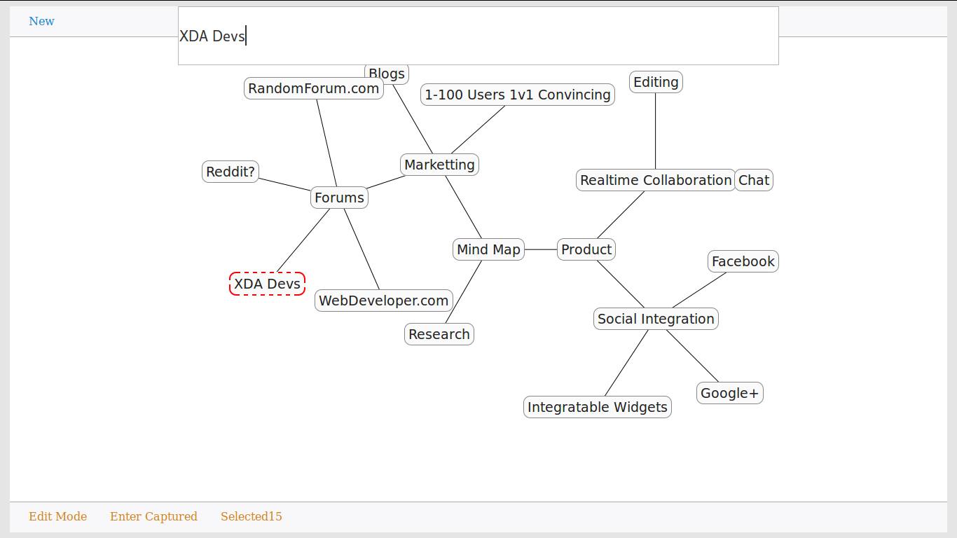
I was also getting into Node.js for back-end web development. So I got started making a Forky server with Node.js backend. It got really tricky to deal with real-time collaboration for the first time. I had no idea how to manage data that could get out of sync across browers, and I spent a lot of time sorting that out. Another point that was annoyingly difficult was trying to have diagrams automatically placing their elements, without things overlapping. I basically just messed around with trigonometry and it was never quite perfect.
But, it looked pretty damn cool, and basically worked. It had some buttons like these which were AWESOME. It also had little previews of diagrams for thumbnails, and showed the diagrams in a grid layout, instead of a list.
I’ll see if I can dig up some screenshots, but so far they are evading me. Rest assured those buttons were really freaking awesome.
Here is the old code.
Iteration 2
About year and a half later, and after I cheered up my sad bank account a little bit, I travelled to Japan to hang out for three months. What can I say, Being a foreigner makes my weirdness look like a feature instead of a bug. Also I have a thing for Asian girls..
Really, I was in Japan for serious business. I was going to rebuild Forky in 3 months and make it profitable and pay my rent (lol).
Having recently fallen in love with Golang, I decided to rewrite the backend in Go. I rebuilt it all pretty quickly (because Golang is almost as epic as . Server side development went well, but the client side still had sticky issues with the auto-layout of boxes in the mindmap. There was not much change in Front-end web development land, so I still used React to build the web app.
Result of time spent? It was pretty cool. Very cool. A beautiful user interface user interface. It was the result of many mornings in Starbucks, and some evening coding sessions.
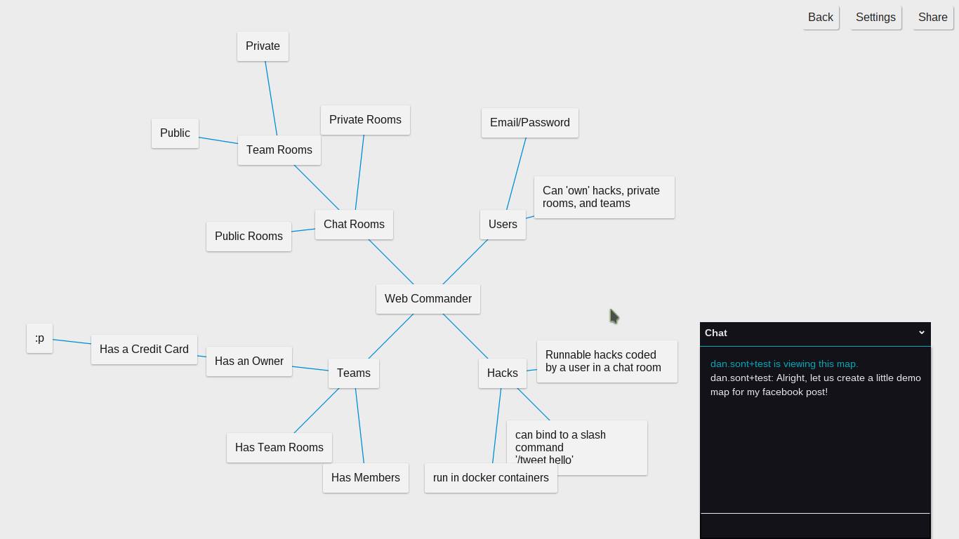
a mindmap
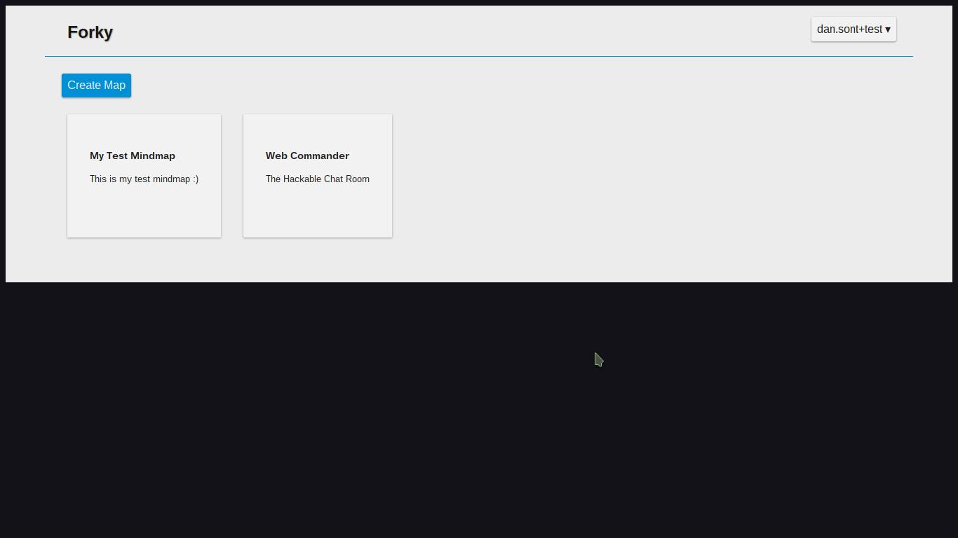
app homepage
I would show a lot of the people I met my app, and so eventually just got 100 signups from talking to strangers in bars in Japan. It was fun to build.
I’ll dig up some code for you soon (because my readers can all code, right??).
All was going well, Forky was up, but I lost heart that anybody would use Forky, and so I focused on my work at Redeam for a couple of years.
Forky Attempt #3
Working at Redeam was fun. I was on a team of Golang ninjas, and I definitally upped my game there. So much so, that I decided a rewrite was in order.
The next Forky was going to be built from microservices, and have redux as a state machine for my front-end. (blah blah blah)
I eventually quit my job at Redeam, to chill out in Asia and work on Forky. I’ll be honest I played a LOT of games and was spoiled with constant distractions, but nevertheless, I never gave up. I chipped away at the architecture, fixing things, testing things, building things I thought Forky needed for it’s initial launch.
I always felt like I would launch in the next month, it ended up being ready a few years later to launch.
My strategy was to get it into the Slack app directory, and then people could just find it from there. I didn’t want to pay for any advertising or marketting. I wanted Forky to grow organically.
Eventually, I thought it was good enough to show to ProductHunt. I wrote a post and to my complete astonishment, people started signing up like crazy. Several signups per hour, and about 180 upvotes, and 400+ signups in a week. That was great! This validated that people would use Forky. Something that, until now, I just had to assume.
I was very excited, and started working on Forky every day to fix any bugs and pretty up the ugliest parts. I also had to make some paid upgrades, so that I get some money from this. I’ve decided to be nice to people. I want everybody to be able to enjoy Forky, even without paying. But I want to have the servers getting paid for, which is currently $100 / month coming from my pocket. It’s tricky, because I have basically no experience with pricing, sales or marketting, but hopefully I’ll be able to earn some money for myself doing this.
Now-a-days, I see a lot of users signing up from schools, and even had a school sign up many classrooms. That was exciting, but I never worked up the courage to ask them how it was working for them. I didn’t want to just cold call them, and felt guilty watching their emails go by. I don’t really know the rules about peoples privacy, so I didn’t want to risk offending somebody. But I want to know what to do with Forky to make these people happy (and help fund this whole thing).
Well, let’s see. Now things are running smoothly, and I can focus on my next move here…
How Forky Turned out
Forky turned out just the way I wanted it.
Forky is a clean interface, fast enough to impress a techie, has a never-ending canvas, and you can make diagrams with minimal effort. On top of that, there are no visible distractions in the mindmap, just your beautiful work from the other day.
Unfortunately, there is no longer auto-layout of nodes. Instead the user gets to place every node where they want. I consider it better than an auto-layout in only 2 directions, such as coggle, or overlapping radial layouts such as my previous attempts. Auto-layout would be nice if you were brainstorming together, but manual layout gives you more freedom of expression, and also you can have disconnected graphs.
Forky turned out great!
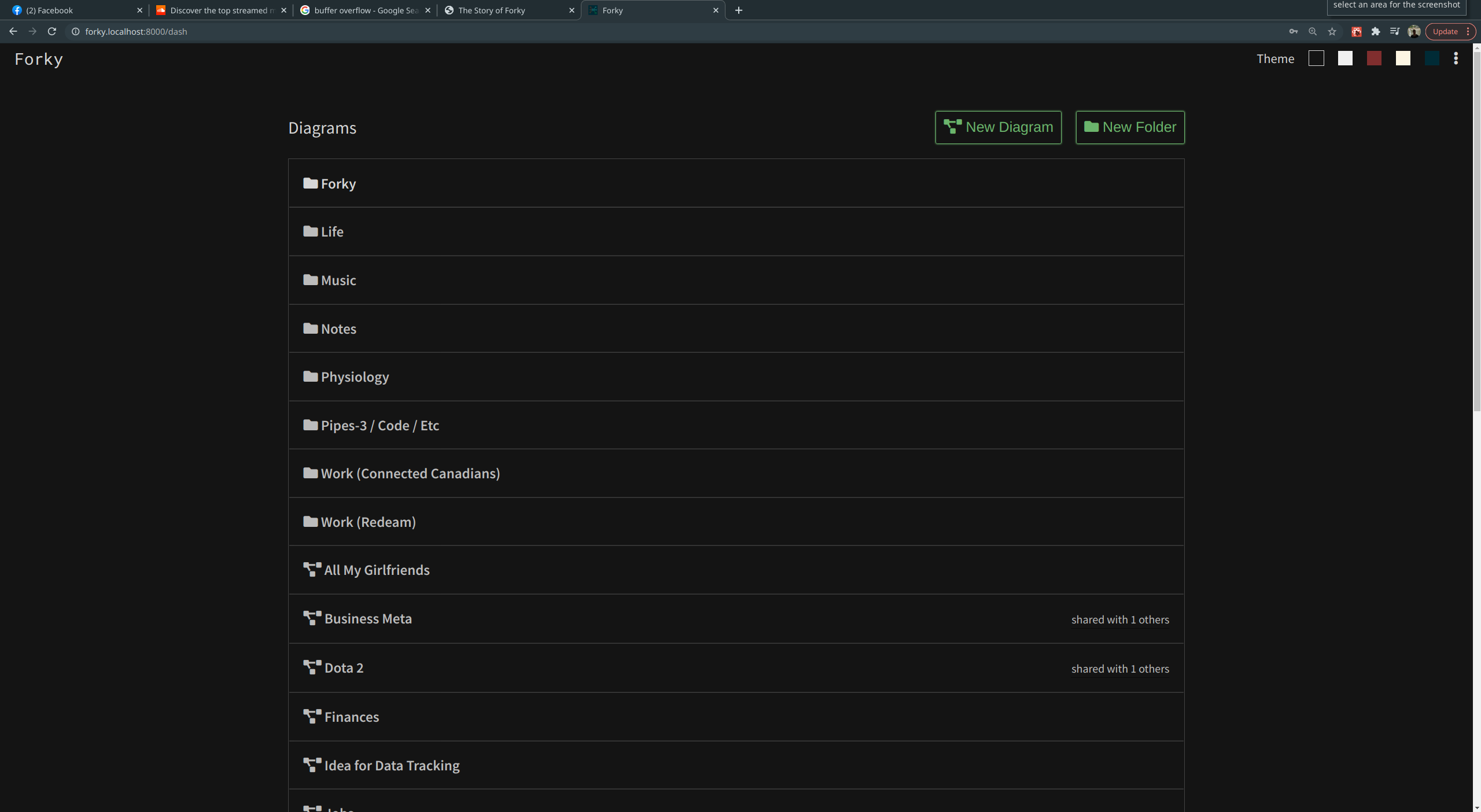
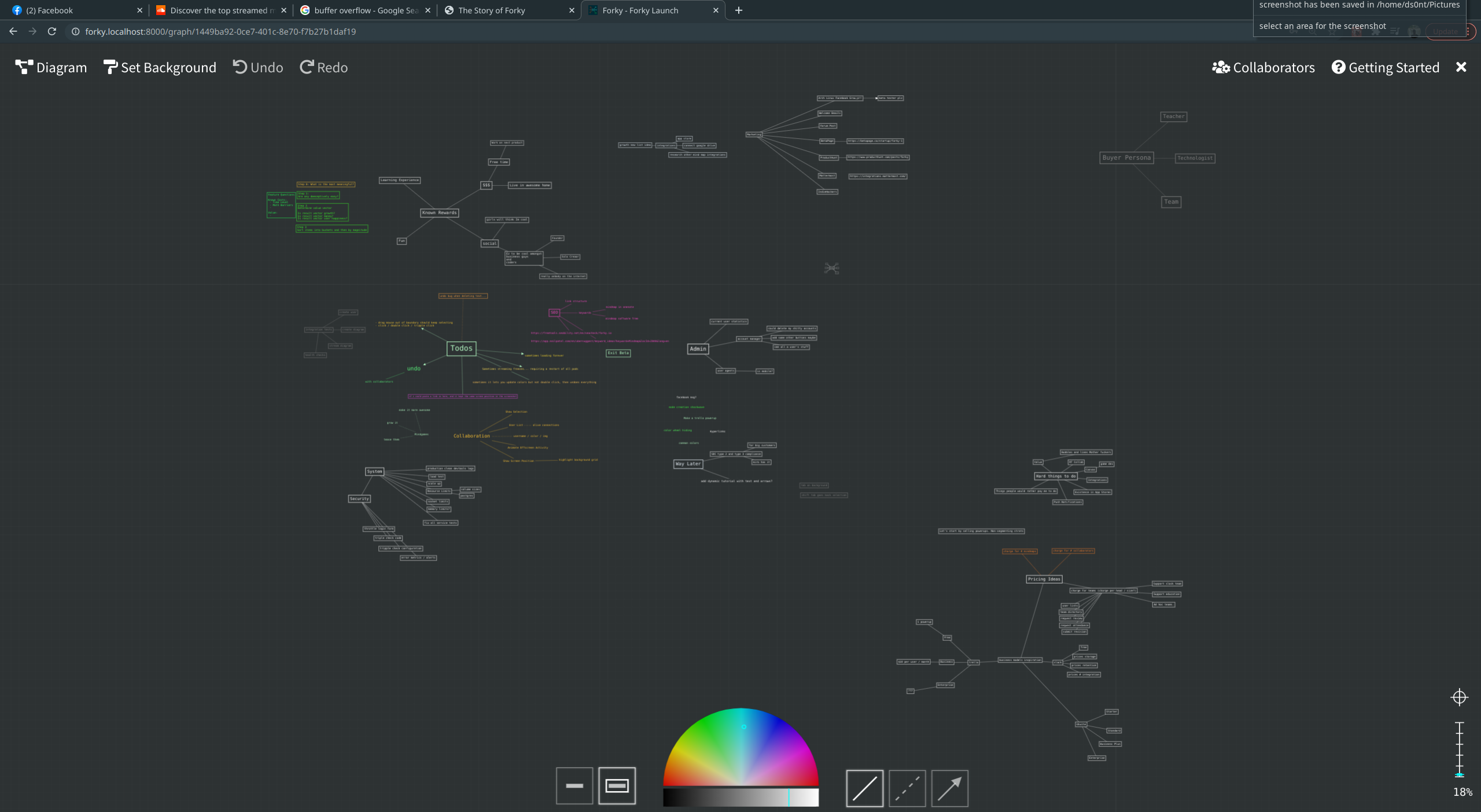
Forky!
There are five color themes (two free). And I can keep adding more, or perhaps even let users style forky to their heart’s content (or discontent). I like playing with colors, so hey, Forky has a lot of colors.
The Bottom Line
You get a cool color wheel at the bottom. Everything is made out of thin lines, and you can color them all to your heart’s content… You know you need a pink background with yellow and white lines, like daffodils of information……
Color wheel for the win! Yes I made that from scratch, mua ha ha, noobs.
Sometimes people ask me for more shapes. I don’t really like the way they look.
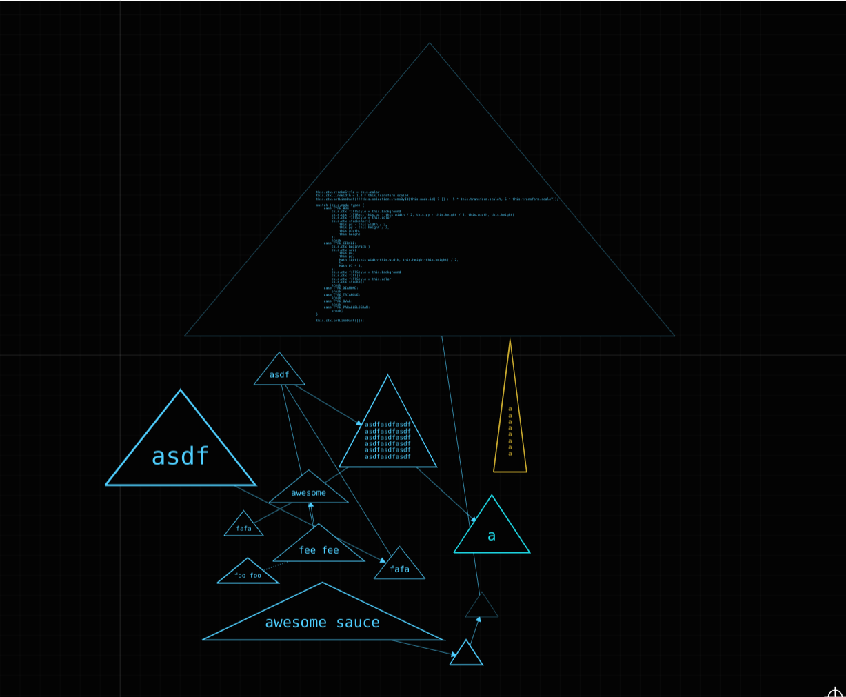
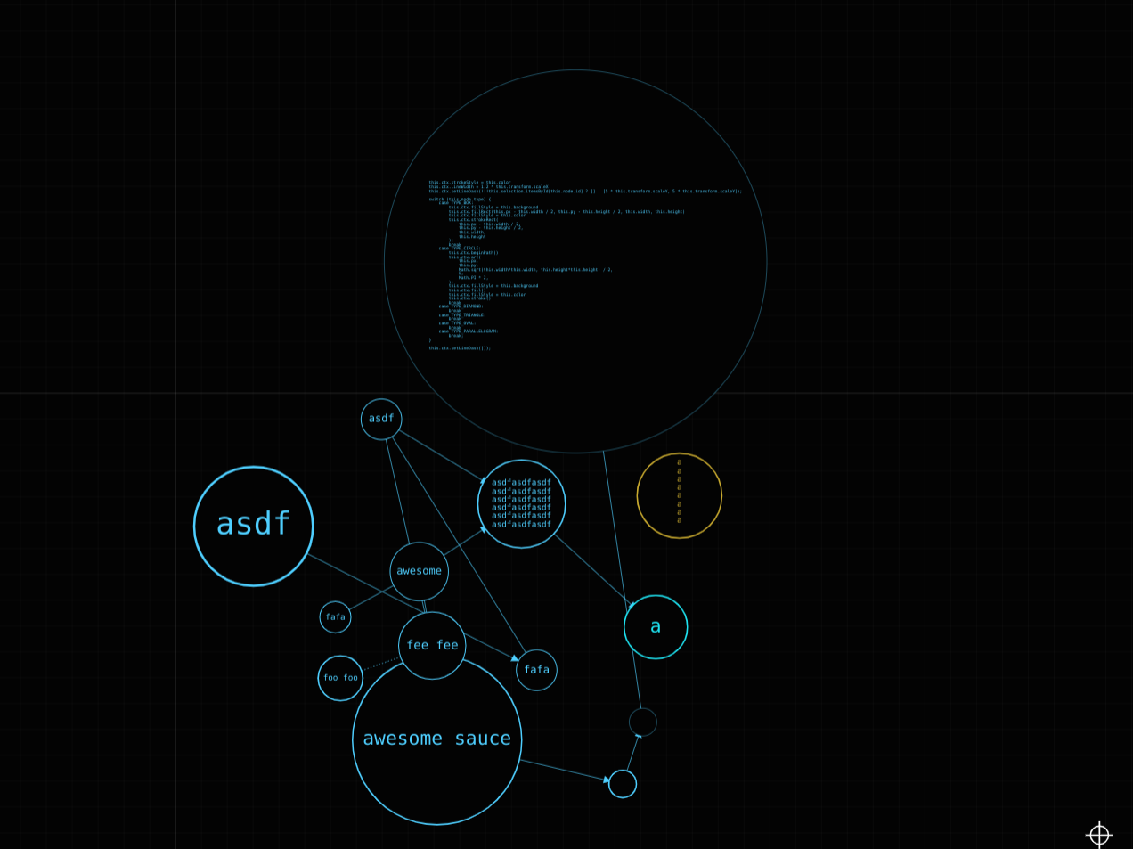
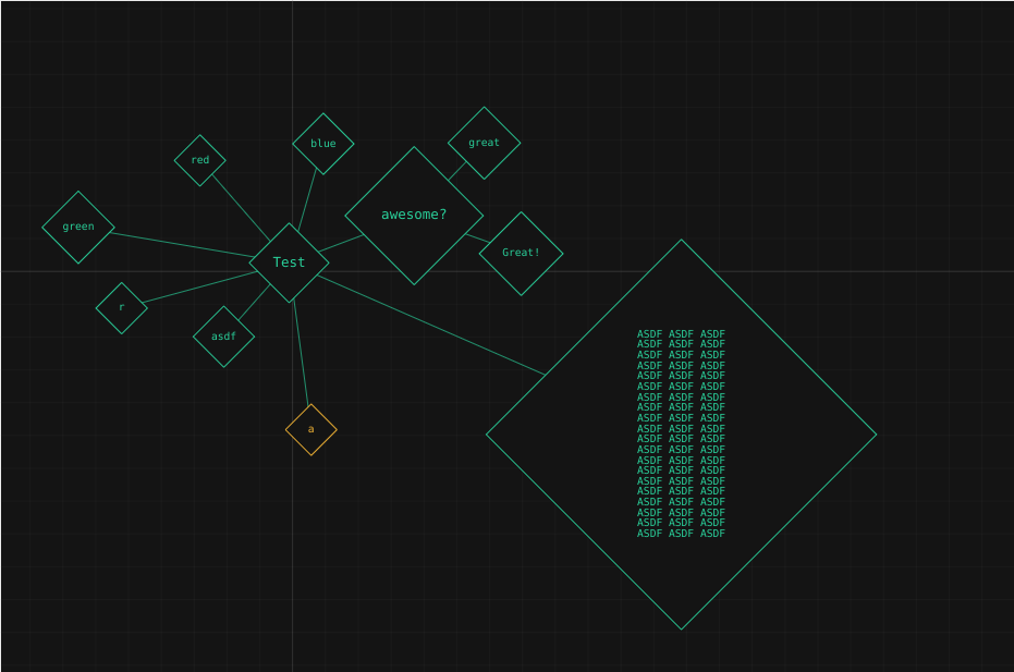
me failing at making different shapes
Colors serve the same purpose as shapes anyways, don’t they?